*This blog is no longer active. For all these posts and more please visit my new blog Maggie Muggins Designs!*


Tuesday, November 24, 2009

Tick Tock Herbie Clock

I bought this table top from IKEA's As Is Section for $1 some time ago. I can't begin to explain how much I love that section. I think the wood was from this table:


I had many ideas for it: A spinning toy, big artwork, something for my son to play with. The more I looked at it the more ideas I got. But nothing ever felt right. One day I saw these clock kits in the isle at Joanns. They have vinyl products for the face of the clock. At the time my son was fascinated with clocks. Really, he still is. I decided to make a clock with the table top. I searched online for a cute "transportation" style clock to go in his room. When I saw this one (shown below) I knew it was what I had to make. My son has loved Herbie from the day he watched "Herbie Fully Loaded" nearly a year ago. Every new or old model VW Bug in the house is Herbie, the same for every VW Bug on the road. He can spot Herbie from miles away.
I already had black and red vinyl and I bought blue vinyl (and probably used $1 worth of them). The clock kit took a while to find as the shaft needed to be long enough for the wood. I found it on Amazon.com for $15.44 including shipping. If I hadn't needed such a specific shaft size it would have cost a lot less (I would have pulled an old clock apart).

Total Cost: About $18.

I cut the vinyl (lines and circle by hand, numbers on my Silhouette) and placed it on the wood. Then I had my husband quickly drill the hole and installed the clock piece. I finished it last week and we hung it yesterday in his room. He could not be more thrilled! I have more in store for his room!


I'm linking up to DIY Day at A Soft Place to Land, Trash to Treasure Tuesday at Reinvented, and Get Your Craft On at Today's Creative Blog. Enjoy viewing the other awesome projects!

Tuesday, November 10, 2009

Thank-You Pottery Barn!

This site is no longer in use. You can see all this information and new posts at my new blog Maggie Muggins Designs.

I have frequented the actual Pottery Barn store twice in my life time. I'm serious. I enjoyed each visit and felt completely at home amid the gorgeous furniture, textiles and home decor, but I was constantly aghast at the prices. Seriously, most of the stuff is way too expensive for me. My first visit was after receiving a gift card to the store one Christmas. It was so delightful to search for the bargains, and even splurge on a beautiful platter, although I am extremely proud of the $0.99 Chargers that I bought as well! Just this week was my second visit to your store. It was a quite fast. (I couldn't browse much with a toddler and new-born in tow.) I did make a purchase which I have to confess I am in love with:


This new rug adorns my living room floor. It looks perfect there. I don't feel that I payed too much either for a lovely wool rug. Not when I would have payed the same or more elsewhere! Thanks for having some reasonably priced items. (Or at least one!)

I must also say Thanks to Living With Lindsay for her recent post on the book Design Rules. It helped me know just what kind of (color of) rug to get to go with my dark green couches.

I must confess though, I like most bloggers out there enjoy the Pottery Barn Knock-Offs. So thank-you Pottery Barn for the inspiration you provide me. It's way easier to make a knock-off when you have something to truly inspire you to do it. Your beautiful magazines, website, and staged stores inspire me to have a beautiful home, only at a fraction of the price I would have to pay you!

Thursday, October 29, 2009

Photo Editing

This site is no longer in use. You can see all this information and new posts at my new blog Maggie Muggins Designs.

I love having fun in Photoshop. Today, in light of the season, I decided to play around with this picture of mini pumpkins that I took last year. I wanted to wash it out more to make the orange one really stand out. First I brightened the colors. Then I used a texture to give it a vintage look. Lastly I rounded the corners.

I love how the photo turned out. It feels a lot less like an actual photograph to me now. I think I'll print this for the dining room for some more seasonal decor.

Before:

After:

Actions: Fresh & Colorful from Pioneer Woman's Action Set 1
Texture: SubtleGrunge4 from Lost and Taken
Rounded Corners: Tutorial from Pioneer Woman

Tuesday, October 27, 2009

DIY Graphic Design

This site is no longer in use. You can see all this information and new posts at my new blog Maggie Muggins Designs.

I'm back with projects to share! I figure a nearly 4 week break was long enough. I've started so many things but I'll confess I'm a little overwhelmed with the idea of going out to purchase the few supplies needed to complete them. I blame it on the brand new baby! I can't wait to share some of my projects with you, here's some recent ones.

A couple of months ago my friend contacted me. (The proud recipient of this creation.) She wanted suggestions for wedding invitations. I replied with what may have been an overload. I explained the various styles, options, do it yourself versions, and wished her luck. Her reply was grateful, but she wanted to know more about the "Postcard" version of wedding invitations. I sat down and quickly threw together a sample for her in Photoshop to give her an idea. Ends up, that's what she decided she wanted. So after much tweaking on my part, a correction of wording and the addition of pictures the invitations (on my end were complete). The trick was finding a good price on printing.

They chose UPrinting.com as their printer. They were quick with getting the invitations to her, made one mistake (Not too serious: they made 600 invitations instead of 200 and sent her the whole bunch without charging her for the extras!) and the quality is great. I love that both sides of the invitation are glossy, unlike a true postcard, and the card stock is a nice weight. I was so excited to get a copy! Here's what it looks like:


That was so easy and so much fun to do! After I had completed the invitations I got on a role. I decided to design shower invitations for my friends shower. These were printed at OvernightPrints.com. This company was cheaper but the quality was great as well. The gloss is a much higher sheen, just too glossy for a wedding invitation, but great for these. I copied the design directly from a site, and added some wording for the theme.


Lastly I did my own baby announcements! Again these were a design I saw online and duplicated. I printed them at the same place as the shower invites. I love them!!!

I'm linking this up to Kimm's Trash to Treasure Tuesday at Reinvented and Kim's Get Your Craft on Party at Today's Creative Blog. I'm also linking up to Kimba's DIY Day on A Soft Place to Land. Head on over to these party's to see other creative projects.


Wednesday, October 7, 2009

Confession # 5: I am a Momarazzi

This site is no longer in use. You can see all this information and new posts at my new blog Maggie Muggins Designs.


Ever since our first son was born I've had this irresistible urge to document my child's life through photography. My habit of capturing cute moments in still grew significantly when my camera was upgraded. Last week our second son was born. All 8lbs 15.1oz of cuteness came out after 15 minutes of pushing. Of course, the fact that I was immobile and had just spent several hours in labor were not going to stop me. Within minutes the camera was back in my hands and I was taking photos of our beautiful little boy.
So to confess that I am addicted to taking pictures of my children might not be surprising for some of you. (Especially for my husband.) But recently I realized the depths of my addictions. I'm not sure if it was the moment I was taking pictures of my son in my hospital bed, or later when I was looking at the various lenses, flash, and other accessories on my Amazon wish list. But I realized I am full fledged member of the Momarazzi! My poor, poor children. I hope I'm not too embarrassing when they're older and I'm on the sidelines cheering and taking pictures.

I need to go take more pictures of my kids. I'll be back with more projects soon. Thankfully I'm recovering quickly!

Tuesday, September 22, 2009

New Blog Header - Trash to This will make do...

This site is no longer in use. You can see all this information and new posts at my new blog Maggie Muggins Designs.

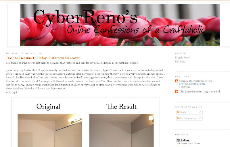
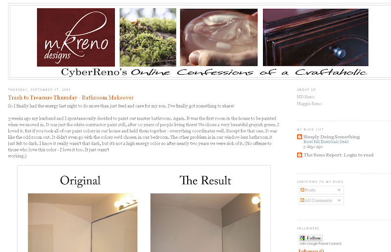
I have been wanting to update my blog ever since I changed it the last time. The old picture was stretched funny, and the design was just underwhelming. Someday I will have time to do something that I absolutely love. But first I have to find a layout I'm in love with, a name that I can use for a blog, a site and a shop, and then design it all. That's just a little too much today. For now, this quick update will have to do.

Before:

After:

Really, it is a very simple change. But I love change. I love to improve things! This really will make do until I can really spend quality time on it. Although it might change once or twice again over the next few days. You never know!

I'm linking this up to Kimm's Trash to Treasure Tuesday at Reinvented. Also linking up to Kim's Get Your Craft on Party at Today's Creative Blog. Head on over to these party's to see other creative projects.


Thursday, September 17, 2009

Trash to Treasure Thursday - Bathroom Makeover

This site is no longer in use. You can see all this information and new posts at my new blog Maggie Muggins Designs.

So I finally had the energy last night to do more than just feed and care for my son. I've finally got something to share!

3 weeks ago my husband and I spontaneously decided to paint our master bathroom. Again. It was the first room in the house to be painted when we moved in. It was just the white contractor paint still, after 10 years of people living there! We chose a very beautiful grayish green. I loved it. But if you took all of our paint colors in our house and held them together - everything coordinates well. Except for that one. It was like the odd room out. It didn't even go with the colors we'd chosen in our bedroom. The other problem is in our window-less bathroom it just felt too dark. I know it really wasn't that dark, but it's not a high energy color so after nearly two years we were sick of it. (No offense to those who love this color - I love it too. It just wasn't
working.)

This is how we had it decorated in there. White, Cream and a little pop of Red here and there. I think it was pretty. It just never felt right.

So we matched the bathroom to the cream in our bedroom. Why? Because the paint store made a mistake and gave me 1 gallon instead of 1/2 a gallon. We had the paint, and it seemed right. Once we got it painted, I had to decorate on a budget. Baby is due in 12 more days!

I dug through my decor stash and found a $5 Goodwill frame to use, just spray painted it black. In the dining room I found another frame and grabbed it off the wall. I also re-purposed several things with a nice coat of spray paint. I love spray paint. The cute white shelves from above that cost me $4 for both originally? Painted them black! The white iron candle holders above the tub? Painted them blue. Just wait, you'll see. Then I spent $17 for new towels. Bathroom makeover complete!

Before:
Here's the frame and other things before I painted them.

The After:

Here's the back wall when you enter the bathroom. Complete with the freshly painted black shelves, red flowers from the living room, and the frame from the dining room. Of course, the blue towels that I bought new.


The wall above the tub. The green frame painted black and monogram I cut from left-over vinyl. I decided to just put it straight on the wall - I think it looks great! The white candle holders painted blue (the towels are the same blue). I'm still not sure if I want to spread them out more or leave them as is.


Lastly, I have a question for you all: Should I paint the Bath Tray or leave it as is? I was thinking black, maybe red? My husband says leave it, but I'm not sure I want to.


I'm linking this up to:
Kimm's Trash to Treasure Tuesday at Reinvented
Kimba's DIY Day at A Soft Place to Land
(I know it's a little late for these, but I'm running on low this week.)
Transformation Thursday at The Shabby Chic Cottage

Head on over to check out all the amazing projects posted by others this week!

Don't be surprised if I my project posts suddenly hault for a little while. I do only have 12 days left until our second son arrives!

Wednesday, September 16, 2009

The Perfect Baby Shower for a Crafter

This site is no longer in use. You can see all this information and new posts at my new blog Maggie Muggins Designs.

I have to tell you about a recent event that I'm still gushing over. My dear friends decided to host a shower for me and the little one on the way. Knowing it was my second child (and second son, at that) they knew I wasn't really up for a huge, overwhelming shower where we played the craziest of games. First, I really like to talk with everyone and games can slow that down, and second, whoever came up with the idea to melt candy bars in diapers and make you guess what they are was not pregnant. I mean that grosses me out normally, but during pregnancy? No thanks!

Of course, my friends know me well. There was delicious food: Meatballs, Spinach Artichoke Dip, Mini Quiches, Vegetables, Mini Cheesecakes, and a most amazing Chocolate Fountain! I was in Heaven. And don't worry, I completely understand and appreciate just how far overboard these girls went for me. Of course, the food is only the beginning. There was the loveliest flower arrangement from Pikes Market (courtesy of the hostess's Husband) especially for me. It made my house smell so beautiful for nearly a week!

You can only imagine my delight when I was told that our evening's activities would be none other than a craft! My friends know me so well! There were several different sizes of white Onesies to decorate. Most of us used the stencils provided with the pens, but some free-handed it. I'm so excited to use these "made with love" Onesies on our soon to arrive son.

Of course there were wonderful gifts from everyone who attended, and even those who weren't able to come. I must say I love all of my friends and I'm especially grateful to the wonderful Hostesses of such a perfect shower for me!

*Photos of the onesies to come.

Tuesday, September 15, 2009

No Creativity in Me Today

This site is no longer in use. You can see all this information and new posts at my new blog Maggie Muggins Designs.

Seriously, I've been so exhausted the last few days. I've been napping lots and trying hard to induce labor. I know I'm jumping the gun two weeks from my due date, but I'd rather just have this over with. So when it comes to my crafts and projects for this week. I've done a few things, but I don't even have the desire to take pictures and post about them. Maybe tomorrow. I've got something really exciting that I plan to start working on this week.

I'm also kicking myself for not doing the dumpster dive I was extrememly tempted to do. I just couldn't think of a re-invention for a headboard. Then today I saw this: Re-purposed Spool Bed. The headboard I almost grabbed was very different from this one, but it would have made a gorgeous bench. Seriously regretting that choice. Of course, my husband is grateful that I'm not cluttering up the garage even more. Anyhow, head on over and check out that project. It really shows you how to re-purpose things.

Tuesday, September 8, 2009

Labor Day in Reno Land

This site is no longer in use. You can see all this information and new posts at my new blog Maggie Muggins Designs.

Is it ironic to anyone else when they are pregnant on Labor Day? I know it's all about giving the workforce a well deserved holiday. Every bone in my body gushes in patriotic pride that this holiday began in Canada and the US copied us. I may have crossed the border but I'm still proud to be Canadian. Anyhow, for me it's ironic because I'm so close to delivering I can't help but focus on that instead of the thousands of people working hard in my community.

I'm due in 3 weeks and honestly, while most of the time I am so busy I forget I'm pregnant today I was feeling it. Swollen feet, that horrible bloated feeling, craving 15 things at once - knowing I would probably only be able to squeeze in a bite at dinner before feeling sick. Ackk. I'm done. Some of you are wondering how it's even possible at 37 weeks to completely forget you're pregnant. I'm not kidding. I even have a story to prove it:

My husband is still in stitches over this. After his long day of painting, cleaning, moving appliances around (he is such an awesome husband) and me watching our son, we decided not to mess up the freshly-painted kitchen and go out to a local buffet for dinner. As I returned from the desert buffet, a lady at our neighboring table asked what I was having. I looked down into my hands and quickly replied "Carrot Cake, and a Brownie." All the while thinking, "what an odd question" as if I'd never been asked it. Her face and my husbands quizzical look made me realize that wasn't the appropriate response. Her next question cleared it all up "Are you having a girl or a boy?" My husband claims my face soon matched my dark red hair and my freckles stood out as I replied "A boy, our second!" We had a good laugh over that.

I did get out shopping for one sale. 50% off everything at the Salvation Army! There wasn't much, honestly, but I did find a frame and this:


It's so perfectly hideous, don't you think? What, pray tell, shall I be doing with it? You shall have to wait and see!

More Artwork Made New

This site is no longer in use. You can see all this information and new posts at my new blog Maggie Muggins Designs.

Over a year ago I was hanging out at a mall while waiting to meet up with my Sister. I strolled into Kohl's and noticed their frames were all on sale. So I decided to check it out. I found these frames with shadow box style art work. It's hard to see from the photo, but one of each of the instruments is popped forward.


They were originally $19.99 each marked as 60% off. The sale was half off that. So they ended up just over $4 each. I really didn't like the inside, but I loved the music theme and the frames themselves.

So for over a year they have sat with my home decor stash waiting for the right use. We recently, and finally, got around to painting our guest bathroom. It used to be a bright lime-ish green. It was hideous. Now it's a really light creamy tan. I love the difference! So with a new color in the bathroom I've decided to re-decorate as well. I decided I want black frames in there. That's when I remembered these ones. I pulled them out and went to work.

I got a huge surprise when I cut the frames open and realized that the shadow box effect was actually another piece of glass with the instruments printed on! I was able to remove that with a scraper, and put vinyl words on that layer instead. I also edited the photos to coordinate them a little.

This is what I came up with:


Eventually I want to put up pictures of my family having fun in the rain, but for now, I've put in these pictures. It will do. I also cut a vinyl saying to place above the photos: "Life isn't about waiting for the storm to pass, it's about learning to Dance in the Rain."

I'm adding this to Trash to Treasure Tuesday over at Reinvented and Today's Creative Blog's Get Your Craft On! Head on over to check out the other projects!

*Update - I'm linking to Kimba's DIY Day on A Soft Place to Land as well. I couldn't help but link up. I really want to win that apron. It's adorable. I think I'm going to head back now to check out what else The Hip Hostess has in their store.


Monday, September 7, 2009

Shadow Box Art

This site is no longer in use. You can see all this information and new posts at my new blog Maggie Muggins Designs.

Over 10 years ago I bought an unfinished shadow box, white-washed it, and then sponge painted it with gold. Inside I carefully arranged a picture of me on my grad night, my corsage and some ribbon. I thought it was so amazing and I had incredible talent. I can't say if I really did, but 10 years later as I went through all my old frames I discovered it. I couldn't resist attempting a make-over for our son's nursery.

BEFORE:

I decided to do a little monkey scene to go with his bedroom. I pulled everything apart and evaluated it. The top mat was great but I'm not a huge fan of gold. I painted the bottom one dark brown. Then I worked on my 3D scene. I pulled the monkeys from my scrapbooking supplies, and then I pulled some old plants and bamboo pieces apart, threw in some twine, and backed it all with a simple fabric. I used a lot of glue and played around with the scene until it seemed just right.

I originally planned to paint the frame as well, it had GOLD on it. But when I popped the shadow box all back together so I could decide what color to paint the frame I decided I actually liked it!

This cost me next to nothing as it came from supplies on hand. It's amazing what you can make-over without going overboard!

AFTER:

This hung in the nursery for a while, but when we were decorating our sons bathroom in our new house I used it there instead. (It completed the Monkey Theme perfectly.)

I'm joining this to Thrifty Decor Chick's Before and After Party. Click on the image below to see her post and all the awesome before and after projects posted.


Thursday, September 3, 2009

Blog Theft

This site is no longer in use. You can see all this information and new posts at my new blog Maggie Muggins Designs.

Recently I read a blog post on Joys of Home of yet another case of blog theft. It’s floating around out there like crazy. While these stories don’t always surprise me, her situation actually did. The person was posting her entire blog, post-for-post as their own. Usually you hear of tutorials being copied and claimed as someone else’s hard work. Or another is family photos being downloaded and edited or used for random things. In a recent news story a woman received an email notifying her that her little child’s picture was being used in an adoption scam. The person was sending the photo of her son to people, which linked to her family blog. And people wonder why my family blog is private?!

While theft from a public blog will remain a threat for many years to come, there are some things that you can do to protect your blog. I have not implemented perfect protection for my own personal blog, but have started the process slowly. I found one article that gives a few good tips on how to create a Creative Commons license and protect your blog through Copyright. These things, however do not stop everyone, so if you experience blog theft, or wonder what to do in that situation, the rest of the article suggests some of the actions you can take.

One of my suggestions, aside from this article is to watermark your own photos. (The "mkr designs…" on my photos is a watermark.) After commenting on Joy’s blog, she emailed me to ask how to make a cute watermark for her photos. Since then, I have been looking for a free, simple method. If you own photo editing software such as Photoshop Elements, Photoshop, or some other in-depth program you’re already set to go, if not there are a few options.

Your choice will, of course depend on the style of watermark that you want.

1. Text Only

Picasa - no customization on font or location. Multiple photos at once. Click here for instructions.

Picnik - font and location customizable. One photo at a time from what I've been able to read. Click here for instructions.

Alamoon Watermark (Free software) - font and location customizable. Multiple photos. Also resizes the photos for you. Click here to download. There is an upgrade for $30 but I'll give you another suggestion in a minute.

These are all relatively easy to use. Picnik is online, Picasa and Alamoon are downloaded to your machine.

2. Customized Text or A Fancy Image

If you're looking for a custom design like your business logo, or even text arranged like my watermark, you're going to need a better program. My watermark is an image that I place on the photo in Photoshop. I designed it using Photoshop. Even if you decide that designing your own Watermark is too much work and have someone do it for you - I still think it's not worth your money to buy a Watermark Program.

Let me explain: If you purchase a Watermark Program you will most likely pay about $30 to get what you want. I would recommend purchasing a copy of Photoshop Elements instead. You can buy it here for $40. $10 more and you have a good photo editing program as well, something that is way more valuable! Isn't that brilliant?

Let me explain why this company has two different prices for the same program. OEM is the simplified software package that a company gets in bulk, usually for the purpose of selling packaged with a computer, notebook, or a software bundle. It's the same program just doesn't come in the standard "Full Retail" box with all the manuals, etc. This one will come with CD's and installation instructions only. I hope that explains it.

I recommend Photoshop Elements because there are so many online tutorials on how to use it and free downloads that you can use in it. Here's how to make a watermark in PS Elements! I actually did something similar, just used the text tool to create 3 separate text pieces and arranged them together as you see on my pictures now. I'll try to make a tutorial for that soon. Here's another tutorial on how to then use the watermark on multiple photos.

I hope this answers some of your questions and helps you decide how you want to protect your photos. Let me know if you have more questions in your comments and I'll try to answer them the best I can.

Wednesday, September 2, 2009

Two-For One Photo Shoot

This site is no longer in use. You can see all this information and new posts at my new blog Maggie Muggins Designs.

Many of you know I love photography. Up until recently though, I've really kept my growing love of photography to capturing pictures of my family, nature, and those fun candid moments with friends. I've shared my first photo shoot with you in another post. That one I was less nervous about. It was mostly pictures of our friends truck and a few family ones thrown in - all for his new company's website.

This shoot made me a lot more nervous. Would I capture the family the way they hoped? Would they be pleased with the results? Would I forget something in my pregnant state of mind? The shoot was for two siblings and their separate families. I was worried about how all the kids would survive.

I prepared in advance, charged all the batteries, wrote a pose cheat sheet to myself just in case things were difficult, and got to the park a little early to have the camera ready. I thought it all through, and even brought a bubble machine so at the end the kids could have at it and I could still (hopefully) get some good pictures.

We're all at the park, everything is going smoothly, I take one picture and my camera froze. Literally - it would not take a picture. I didn't know what to do. Pressed a million buttons, changed settings, and powered off. Nothing worked. I prayed, removed the battery, and started over. It worked. (There's nothing like the power of prayer!)

Here's a quick peak for all to see. These are just a sprinkling of the photos I was able to get of these two wonderful families! The kids were great, the park was beautiful, and the bubbles were the perfect hit.

The First Family

An Outfit Change

The Second Family

One of my Favorites. I must tell you, this was a lucky shot - the littler sister is about to rip the older sisters arm off her shoulder.

Just one of the adorable shots captured around the bubble machine.

Thanks so much to my friends who were so willing to let me practice on them. I had so much fun taking and editing their photos. Despite their worries that I might be a little too far along in the pregnancy.

Tuesday, September 1, 2009

Lamp Revamp

This site is no longer in use. You can see all this information and new posts at my new blog Maggie Muggins Designs.

Another Trash to Treasure Tuesday here! I'm actually getting so much more done by challenging myself to have an entry every week.

A few short months after we learned I was pregnant with our second we moved our son into his new bedroom. The transportation themed room with a Thomas The Tank Engine toddler bed (bought on Craigslist, I would NEVER pay full price for that) replaced our Guest Room. That left a lot of things without a home. These for example:


These IKEA Grono lamps, which I've had for a decade (no joke), have sat around the house for months now, with no home. Oh sure, they're cute as is. But after a while I get bored with the same old. So it was time to make a change or just get rid of them. At first I planned to pair them and do something like I saw on IKEA Hacker:


That would have been adorable - but I had no idea where I'd put them. I just didn't need a pair of lamps anywhere. (I know, some of you are thinking I could have sent them your way. Sorry.)

In the end I decided to make two distinct lamps. Each is a very unique style

The first Revamp was for our Jungle Themed Nursery. I searched for the right image, imported it into Robo Master, added some text and cut this beauty out of Vinyl on MY NEW SILHOUETTE! (Saving that for another post.) Here's the first lamp:


The second lamp is for my niece. Her Mom won my Give away a while back for the Young Women's Plaque. (No it was not rigged.) Seeing as she just had a birthday, I thought this would be a really fun thing to personalize for her. This was also cut on my new machine. It's just scrapbooking paper and I stuck it on with Mod Podge. I'm still considering adding a ribbon. Happy Birthday B I hope you like your gift!


Head on over (or back) to Reinvented to see everyone else's awesome projects this week. I've already seen a few and I'm so inspired! Also check out my Tutorial for dressing up a soap pump, including the free file here.

I'm also linking this up to Kimba's DIY Day on A Soft Place to Land. Head on over to her blog to check out many more DIY projects.

Monday, August 31, 2009

Clean Hands Soap Pump (Free File and Tutorial)

This site is no longer in use. You can see all this information and new posts at my new blog Maggie Muggins Designs.

A while back I saw this cute soap dispenser on the bathroom counter at one of my friends houses. Then a few weeks ago I was reminded of it as I spoke with our another friend who is in charge of organizing the Super Saturday for our Ward. She was considering doing this and asking how. I said I could make the print-out for her. And it was really easy to do.


I've decided to share the file for this simple craft with you. In order to share the file I've removed the personalization (The _____ Family) on the top and chosen a few different headers in hopes that one will work for you:

Our Little Monkeys
Our Happy Family
Mother
Grandma
His
Her

The last two (His and Her) would be a really cute addition to a towel set for a wedding gift! Hopefully those Headers will give you enough variation to choose from for gifts. Let me know if you any other ideas and maybe I'll make another file.

You can download the file here. *Note the view of the file looks like it's missing a dot in the line, but the actual file has it there.

This is designed to fit the cheap soap dispensers from WalMart. It must be printed on overhead transparencies with either a Laser printer or photocopied onto it. Home printers (InkJet) do not set the ink as required so once it's in the soap dispenser the ink will run. If the design is not the right size for your bottle, you can blow it up or shrink it when copying.

You can also purchase empty soap dispensers from Industrial Container and Supply Co. The part numbers are: Bottle - B3221, Pump - DP111E. Contact the company for prices and shipping costs.

Instructions

1. Peel the labels off the soap dispenser, use a blow-dryer to soften the glue and Goo Gone on the left over glue.

2. Cut the transparency to size. Make sure to leave a clear space on the bottom so that the words are at the height you would like. Test this on the outside of the dispenser before putting it in.

3. Roll up the transparency and squeeze it into the bottle. It will unroll once it's inside the bottle. Push it with the pump to the front of the bottle.

4. Put the pump back on, and if desired tie a cute ribbon around it.

Note: if you are using the empty containers make sure the transparency is sitting at the front of the bottle before filling the bottle with soap. Otherwise the pump will block some of the words.

Please let me know if you have problems downloading the file. Enjoy!

I'm linking this project to Today's Creative Blog's "Get Your Craft On".

Sunday, August 30, 2009

I Know I Disappeared

This site is no longer in use. You can see all this information and new posts at my new blog Maggie Muggins Designs.

This week has been a whirl-wind of activity at my house. While we continue painting and I have started to catch up on sewing - I had my second photo shoot this week. This time, not for a business. I did family portraits for some friends! It was a blast, they were so patient with me, and I can't wait to tell you all about it. But for now I sneak away to bed. Not without mentioning my newest crazy creation: Wedding Invitations for a friend. Can't wait to get her photos to put it all together. I'll be back tomorrow to tell you all about it. Bye.

Tuesday, August 25, 2009

Camera Strap Make-Over with Tutorial

This site is no longer in use. You can see all this information and new posts at my new blog Maggie Muggins Designs.

I've been seeing cute camera straps lately. They are all the rage. Etsy sellers have anything from the $6 (on sale) Camera Strap Cover to the $39 Recycled Seat Belt Custom Camera Strap. Honestly, I had a strap (and it wasn't trash - just not cute), so I just couldn't justify a cute custom strap. I could easily make myself a strap cover, but that wasn't the look I really wanted. So when I was in Joann's looking at the big bin of grosgrain ribbon spools and saw some really cute ribbons I envisioned a quick and easy project immediately.

This is so easy anyone with sewing capabilities will be kicking themselves for spending money just to have a cuter strap than the one they already own.

Before:
Here's the strap that came with my camera back in February. I finally pulled it out of the packaging last month.


1. Choose the ribbon. I used grosgrain ribbon because it's strong, looks good and had several cute styles. My strap is 1.5 inches wide, so I got 1.5 inch wide ribbon. Pretty simple. At first I wanted a really cute pink with white polka-dots and brown ribbon. But my strap is black and red and the way it would all be put together the red would still show a little on the edges. Pink and brown didn't really go with the black and red. So I opted for a white ribbon with black and red flowers. It cost $2.50 for a 4 yard spool. I have tons left over.


2. Cut the ribbon to the length of the strap. This is the length between the two leather pieces plus about 1 inch to be able to tuck in the ends.


3. Pin the ribbon to the strap. This is a little difficult if the strap is thick, but it will help as you sew. Tuck the ends of the ribbon under just before the leather sections. You can see how this is done in the picture just after Step 5 if you skip ahead. I tried very hard to line it up the best I could so it's not too obvious.

*The rest of my pictures are taken after I put the strap on the camera, hence, the quality is not as good because they are taken with our smaller camera. Sorry.

4. This is a really important step. Match the upper thread on your machine to the ribbon and the thread in the bobbin to the back of the camera strap. I used white on top and black underneath. This keeps the strap looking well made - if I'd had white thread on the black back of the strap it would look less professional. See - you can't tell on this side that anything was changed!


5. Sew the entire perimeter of the ribbon and strap, close to the edge. Remove the pins as you sew. If you are worried about the ribbon not laying flat, sew down both edges from the same end then sew the widths on either end. I didn't need to do that with my strap though. Here you can see how that red from the strap shows - I'm so glad I chose a coordinating color!


6. Put your new strap on your camera and enjoy!


While this wasn't really trash to begin with I think it's safe to say the make-over has significantly improved the strap! Once again I'm linking up to Trash to Treasure Tuesday. Kimm's post this week was a good reminder to me of life's lessons and how we just need to keep going and remember God even when the unexpected happens.